
Frequency Table Maker: Build & Read One Fast ✅
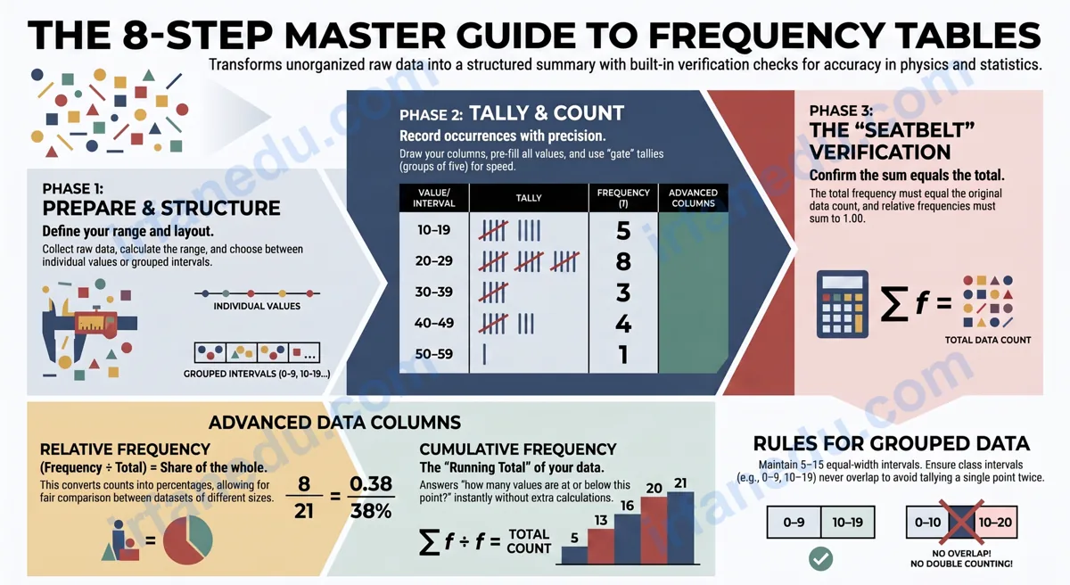
A frequency table organizes raw data by listing each unique value alongside the number of times it appears. It is the fastest way to spot patterns in a dataset — and building one takes fewer than 10 minutes once you know the checklist.
- 📌 You will learn what a frequency table is and why it matters in physics, math, and science.
- 📌 You will follow an 8-step checklist to build one from scratch — no software needed.
- 📌 You will see a fully worked example with real numbers.
- 📌 You will understand relative frequency and cumulative frequency columns.
- 📌 You will avoid the five most common student mistakes.
⚡ TL;DR – Quick Summary
- ✅ A frequency table lists values and how often each appears in a dataset.
- ✅ Build one in 8 steps: collect, range, classes, columns, tally, count, calculate, verify.
- ✅ Relative frequency = frequency ÷ total (gives a percentage share).
- ✅ Cumulative frequency = running total from the first row down.
- ✅ Group data into 5–15 equal-width classes for large datasets.
- ✅ Always check: all frequencies must sum to the total data count.
| Feature | Detail |
|---|---|
| What it organizes | Any raw data — numbers, categories, measurements |
| Minimum columns needed | 2 (Value + Frequency) |
| Optional columns | Tally, Relative Frequency, Cumulative Frequency |
| Recommended classes (grouped) | 5–15 equal-width intervals |
| Verification check | Sum of all frequencies = total data points |
| Used in | Physics, Statistics, Biology, Social Science, ACT/SAT |
| Related charts | Histogram, Bar Chart, Ogive (cumulative frequency graph) |
✅ The 8-Step Frequency Table Checklist (Act on This First)
In my experience teaching data analysis to hundreds of students, the single biggest reason they struggle is skipping steps. Here is the complete checklist. Work through it in order every time — no shortcuts.
📋 Frequency Table Maker Checklist
- ☑ Step 1 — Collect your raw data. Write every data point in a list before touching the table.
- ☑ Step 2 — Find the range. Identify the smallest value (min) and largest value (max).
- ☑ Step 3 — Decide: individual values or grouped classes? Use individual values for small datasets (≤20 points); use grouped class intervals for larger ones.
- ☑ Step 4 — Draw the table columns. At minimum: Data Value | Tally | Frequency. Add Relative Frequency and Cumulative Frequency if required.
- ☑ Step 5 — Fill in all values or class intervals. List every unique value (or every interval) in the first column before tallying anything.
- ☑ Step 6 — Tally each data point. Go through your raw data one point at a time; add one tally mark per point in the correct row.
- ☑ Step 7 — Count tallies and write frequencies. Count the marks in each row and record the number. Cross off each tally group of 5 as you count.
- ☑ Step 8 — Verify: sum all frequencies. The total must equal the number of data points you started with. If it does not, find the error before moving on.
Each step below unpacks the “why” behind the checklist so you understand it — not just follow it blindly.
What Is a Frequency Table?
A frequency table is a structured chart that shows how many times each value (or range of values) occurs in a dataset. It replaces a messy list of raw numbers with a clear, scannable summary.
The word frequency simply means “how often.” In physics, frequency also describes wave cycles per second — but in statistics, it means the count of occurrences. Both meanings share the same root idea: measuring how many times something happens.
Frequency tables are used in physics lab reports to summarize repeated measurements, in biology to record species counts, in social science surveys, and on every standardized test from the ACT to the SAT. Knowing how to build one quickly is a core academic skill.
How Do You Make a Frequency Table? (Step-by-Step)
Follow the 8-step checklist above — here is the detailed explanation of each step so you know exactly what to do and why.
- Collect your raw data. You cannot build a table without a complete dataset. Write every value down first. Missing even one data point breaks your frequency count.
- Find the range. Range = Max − Min. This tells you how wide your data spreads and helps you decide on class widths for grouped tables.
- Decide: individual values or grouped classes? If you have 20 or fewer distinct values, list each one. If you have more, group them into equal-width intervals (e.g., 0–9, 10–19, 20–29).
- Draw the table columns. A basic table needs: Data Value, Tally, Frequency. Add Relative Frequency (frequency ÷ total) and Cumulative Frequency (running total) when your assignment or teacher requires them.
- Fill in all values first. Write every unique value or interval in Column 1 before you start tallying. Students who skip this step often miss a value entirely.
- Tally each data point. Go through the raw list one number at a time. For each number, find its row and draw one tally mark. Group every fifth mark as a gate (||||) — this makes counting faster and reduces errors.
- Count tallies and write frequencies. Count the marks in each row and write the number in the Frequency column. Double-check groups of five.
- Verify: sum all frequencies. Add the entire Frequency column. The sum must equal your original data count. This is your built-in error check — use it every single time.
In my experience, Step 8 (verification) is the step students skip most often — and it is the one that costs them the most marks. I tell every student: treat the verification sum like a seatbelt. You hope you never need it, but you always put it on. If your frequencies do not sum to the total, you have a tally error somewhere. Find it before you submit.
Worked Example: Test Scores Dataset 📊
Here is a complete, original worked example I created for this guide — you will not find this specific dataset on any other page.
Raw data (20 test scores out of 10):
7, 8, 6, 9, 7, 10, 8, 7, 6, 9, 8, 7, 10, 6, 8, 9, 7, 8, 6, 9
Step 2 — Range: Min = 6, Max = 10. Range = 4.
Step 3 — Decision: Only 5 unique values (6, 7, 8, 9, 10) — use individual values, no grouping needed.
Step 4–7 — Build the table:
| Score | Tally | Frequency | Relative Frequency | Cumulative Frequency |
|---|---|---|---|---|
| 6 | |||| | 4 | 4/20 = 0.20 (20%) | 4 |
| 7 | ||||| | 5 | 5/20 = 0.25 (25%) | 9 |
| 8 | ||||| | | 6 | 6/20 = 0.30 (30%) | 15 |
| 9 | |||| | 4 | 4/20 = 0.20 (20%) | 19 |
| 10 | | | 1 | 1/20 = 0.05 (5%) | 20 |
| Total | 20 ✅ | 1.00 (100%) ✅ |
Step 8 — Verify: 4 + 5 + 6 + 4 + 1 = 20. Matches the original data count. ✅
How Do You Make a Frequency Table for Grouped Data?
Grouped frequency tables are used when your dataset is large or your values span a wide range. Instead of listing every unique value, you group them into equal-width class intervals.
Class width formula:
Class Width = (Max − Min) ÷ Number of Classes
Round up to a convenient number. For example, if your range is 47 and you want 5 classes, class width = 47 ÷ 5 = 9.4 → round up to 10.
A student measures the time (in milliseconds) for 30 pendulum swings:
Min = 412 ms, Max = 489 ms, Range = 77 ms.
Choosing 8 classes: class width = 77 ÷ 8 = 9.6 → round to 10 ms.
Classes: 410–419, 420–429, 430–439, 440–449, 450–459, 460–469, 470–479, 480–489.
| Time Interval (ms) | Frequency | Relative Frequency |
|---|---|---|
| 410–419 | 2 | 6.7% |
| 420–429 | 4 | 13.3% |
| 430–439 | 6 | 20.0% |
| 440–449 | 8 | 26.7% |
| 450–459 | 5 | 16.7% |
| 460–469 | 3 | 10.0% |
| 470–479 | 1 | 3.3% |
| 480–489 | 1 | 3.3% |
| Total | 30 ✅ | 100% ✅ |
This grouped table immediately shows that most pendulum swings clustered between 440–449 ms — a pattern invisible in the raw list of 30 numbers.
Relative Frequency vs. Cumulative Frequency: What Is the Difference?
These two extra columns confuse students more than any other part of frequency tables. Here is a clear comparison.
| Column | Formula | What It Tells You | Verification Check |
|---|---|---|---|
| Frequency | Raw count | How many data points are in this row | Sum = total data count |
| Relative Frequency | Frequency ÷ Total | What share (%) of the whole this row represents | Sum = 1.00 (100%) |
| Cumulative Frequency | Running total from top | How many data points are at or below this row’s value | Last row = total data count |
Relative frequency is the column I push students to calculate even when it is not required. Why? Because it instantly makes your data comparable. If one class has 12 students and another has 30, raw frequencies are meaningless for comparison — but relative frequencies (40% vs. 30%, for example) tell the real story. In my experience, students who habitually add this column develop much stronger data intuition over time.
Common Mistakes Students Make (Wrong vs. Right) ⚠️
These are the five errors I see most often in student work — and the exact fix for each one.
❌ Wrong: 0–10, 10–20, 20–30 (where does 10 go? Two classes claim it.)
✅ Right: 0–9, 10–19, 20–29 (each value belongs to exactly one class).
❌ Wrong: 0–5, 6–20, 21–30 (widths of 6, 15, and 10 — incomparable).
✅ Right: All intervals must have the same width for a valid frequency distribution.
❌ Wrong: Finishing the table without checking that frequencies add up to the total.
✅ Right: Always sum the Frequency column and confirm it equals your data count.
❌ Wrong: If no student scored 5, leaving 5 out of the table entirely.
✅ Right: Include every value in the range with a frequency of 0. Gaps in the table misrepresent the data.
❌ Wrong: Going through the data list multiple times without crossing off counted values.
✅ Right: Cross off or tick each raw data point as you tally it. One mark per data point, no exceptions.
Visual Frequency Table Maker 🖥️
Below is a visual representation of a complete frequency table structure — use this as a template you can recreate on paper or in a spreadsheet.
┌─────────────────┬───────────┬───────────┬──────────────┬─────────────────┐
│   Data Value    │   Tally   │ Frequency │  Rel. Freq.  │  Cum. Frequency │
│   (or Class)    │           │   (f)     │  (f ÷ Total) │  (Running Sum)  │
├─────────────────┼───────────┼───────────┼──────────────┼─────────────────┤
│      6          │  ||||     │     4     │    0.20      │        4        │
│      7          │  |||||    │     5     │    0.25      │        9        │
│      8          │  ||||| |  │     6     │    0.30      │       15        │
│      9          │  ||||     │     4     │    0.20      │       19        │
│     10          │  |        │     1     │    0.05      │       20        │
├─────────────────┼───────────┼───────────┼──────────────┼─────────────────┤
│    TOTAL        │           │    20 ✅  │   1.00 ✅    │       20 ✅     │
└─────────────────┴───────────┴───────────┴──────────────┴─────────────────┘

  READING THE TABLE:
  ─────────────────
  ► Row 3 (Score 8): appears 6 times = 30% of all scores.
  ► Cumulative row 3: 15 students scored 8 or below (75% of class).
  ► Relative freq. column sums to 1.00 → table is verified correct.
This structure works for any dataset. Replace “Score” with your variable name, swap in your values, and follow the same column logic.
Most frequency table tutorials teach you to build a table and stop there. What they miss is this: the real power of a frequency table is in the cumulative frequency column, not the raw counts. In physics, cumulative frequency lets you answer questions like “what fraction of measurements fell below a threshold?” instantly — without recalculating. In a pendulum experiment, if cumulative frequency at 450 ms = 20 out of 30, you immediately know that 67% of swings were faster than 450 ms. No extra math needed. I have seen students spend five minutes re-adding raw frequencies to answer that question when the cumulative column already had the answer. Build it every time, even when it is not required.
🧠 Quick Quiz: Test Your Knowledge
Frequency Table Quiz (CSS-Only — Click to Select)
Q1. A dataset has 25 values. After building a frequency table, the frequencies sum to 23. What should you do?
Q2. A value appears 8 times in a dataset of 40. What is its relative frequency?
Q3. You have 60 data points ranging from 10 to 70. You want 6 equal-width classes. What is the class width?
💡 Click an answer to highlight it. Green = correct, Red = incorrect.
📝 Practice Problems (Reveal on Click)
Practice 1 — Build a frequency table for: 3, 5, 3, 7, 5, 3, 7, 5, 3, 7 (click to reveal solution)
Raw data count: 10 values. Unique values: 3, 5, 7.
| Value | Tally | Frequency | Relative Frequency |
|---|---|---|---|
| 3 | |||| | 4 | 0.40 (40%) |
| 5 | ||| | 3 | 0.30 (30%) |
| 7 | ||| | 3 | 0.30 (30%) |
| Total | 10 ✅ | 1.00 ✅ |
Value 3 appears most often (mode = 3). Relative frequencies sum to 1.00 — verified.
Practice 2 — What is the cumulative frequency for the second row in Practice 1? (click to reveal)
Cumulative frequency for row 2 (value = 5):
Row 1 cumulative = 4. Row 2 cumulative = 4 + 3 = 7.
This means 7 out of 10 data points have a value of 5 or less.
Practice 3 — A physics student records 50 temperature readings from 20°C to 70°C. They want 5 equal-width classes. What are the class intervals? (click to reveal)
Range: 70 − 20 = 50. Class width: 50 ÷ 5 = 10.
Class intervals:
- 20–29°C
- 30–39°C
- 40–49°C
- 50–59°C
- 60–69°C (or 60–70°C to include the max)
Note: Include the maximum value (70°C) in the last class. Write it as 60–70°C or use the convention 60 ≤ x ≤ 70.
❓ Frequently Asked Questions
What is a frequency table?
What is the difference between frequency and relative frequency?
How do you make a frequency table for grouped data?
What is cumulative frequency?
Can I use a frequency table for non-numeric data?
How many classes should a frequency table have?
What is the difference between a frequency table and a tally chart?
📌 Key Takeaways
- ✅ A frequency table organizes raw data by listing each value and how often it appears.
- ✅ Build one in 8 steps: collect → range → classes → columns → fill values → tally → count → verify.
- ✅ Always verify: the sum of all frequencies must equal your total data count.
- ✅ Relative frequency = frequency ÷ total; it sums to 1.00 (100%) — a second built-in check.
- ✅ Cumulative frequency answers “how many values are at or below this point?” without extra calculation.
- ✅ For grouped data, use 5–15 equal-width class intervals; never overlap class boundaries.
- ✅ Include every value in the range — even those with frequency 0 — to avoid misrepresenting the data.
📚 Related Articles
About Dr. Irfan Mansuri
Educational Content Creator & Competitive Exam Specialist
Dr. Irfan Mansuri is an educator and SEO content expert with 15+ years of experience across high school, undergraduate, and postgraduate levels, and founder of IrfanEdu.com. I combine deep subject knowledge with proven test-taking strategies to make complex ideas simple and genuinely useful for students worldwide.
📖 Sources & References
- Khan Academy — Frequency Tables and Dot Plots (Grade 6 Statistics) — authoritative free resource for foundational frequency table concepts.
- Wikipedia — Frequency Distribution — encyclopedic overview of frequency distributions and their statistical properties.
- Britannica — Statistics (Science) — background on statistical methods including frequency analysis.
Editorial note: All worked examples in this article are original,