
Charter Map Explained: How to Read & Use One (Complete Guide)
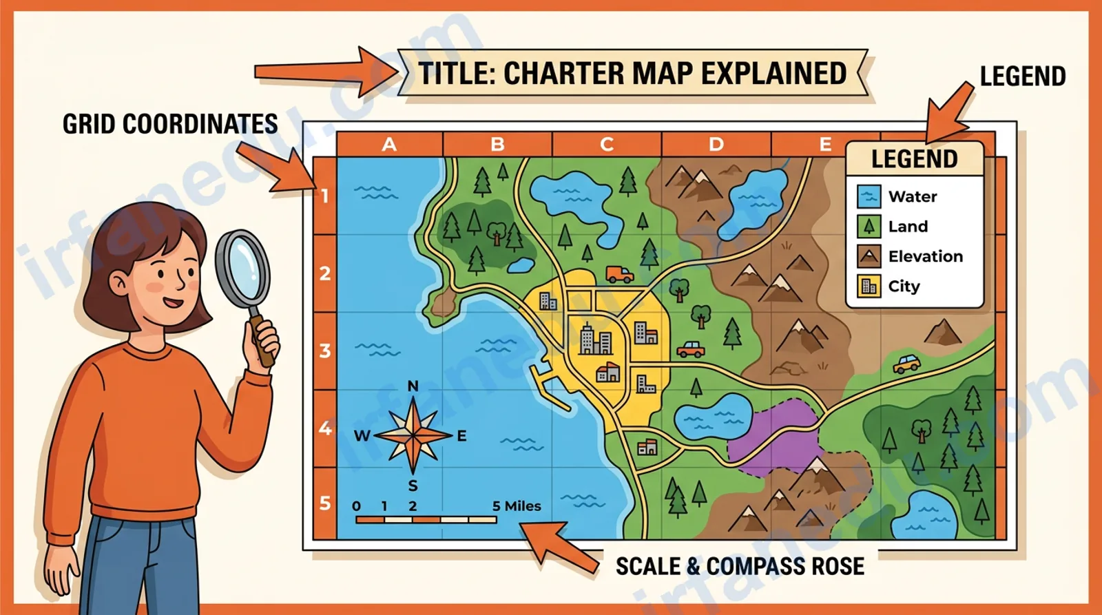
Meet Priya. She is a seventh-grader who just got a social studies assignment: use the charter map on page 14 of her textbook to answer five questions about trade routes. She opens the page, stares at the grid, the colored regions, the tiny legend in the corner, and the scale bar at the bottom. She has no idea where to start.
Sound familiar? You will follow Priya’s assignment throughout this guide. By the end, she (and you) will answer every question in under five minutes, using a repeatable five-step method.
⚡ TL;DR
- 📍 A charter map organizes information into labeled, structured sections for fast lookup.
- 📍 Every charter map has five core parts: title, legend, grid, scale, and data sections.
- 📍 Read it in five steps: title → legend → grid → scale → cross-reference.
- 📍 Charter maps differ from regular maps by adding a structured data layer.
- 📍 They appear in school from Grade 2 and grow more complex through high school.
- 📍 Digital charter maps in tools like Google Sheets are now the most common form.
What Is a Charter Map? 🗺
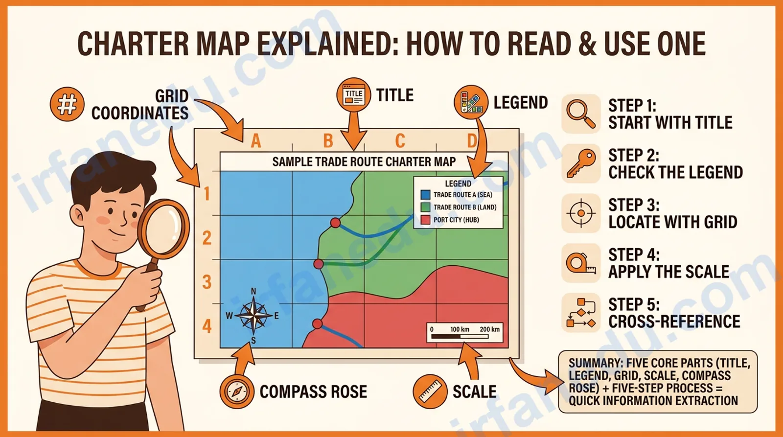
A charter map is a structured visual tool that combines a spatial or organizational layout with clearly labeled data categories, allowing a reader to locate, compare, and extract specific information quickly. Think of it as a hybrid between a map and a table: it has the spatial logic of a map (regions, grids, orientation) and the data clarity of a chart (columns, categories, labels).
The word “charter” here carries the sense of a formal, organized document, the same root as a company charter or a ship’s charter. A charter map is, in essence, a formally organized information map, not just a sketch of terrain.
In school, you will encounter charter maps most often in social studies, geography, and science. A US states charter map, for example, might show each state in its correct position on a grid while also listing its capital, population range, and region category in a legend. That combination of “where” and “what” is the defining feature.
Quick Facts at a Glance ⚡
| Feature | Detail |
|---|---|
| Full name | Charter Map (also called reference map, structured map, or data map in some curricula) |
| Core purpose | Organize and display structured information spatially for fast lookup and comparison |
| Key parts | Title, Legend/Key, Grid/Index, Scale, Data Sections |
| Common formats | Paper textbook maps, printed reference charts, digital spreadsheets, GIS layers |
| Grade range | Grade 2 (simple) through college (complex multi-layer) |
| Subject areas | Social Studies, Geography, Science, History, Project Management |
| Digital tools | Google Sheets, Microsoft Excel, Canva, ArcGIS, Google My Maps |
| Related concepts | Thematic map, reference map, data table, comparison chart, GIS map |
What Are the Five Core Parts of a Charter Map? 🔍
Every charter map, from a simple classroom handout to a professional GIS layer, contains five core parts. Knowing these parts is the foundation of reading any charter map correctly.
1. Title
The title tells you the subject, scope, and sometimes the time period of the map. Always read it first. A title like “US Trade Routes 1800–1850” immediately tells you this map covers domestic trade, not modern logistics.
2. Legend (Key)
The legend decodes every symbol, color, line style, and abbreviation used on the map. Skipping the legend is the single biggest mistake students make. A blue line might mean a river on one map and a trade route on another.
3. Grid or Index
The grid divides the map into numbered columns and lettered rows (like A3 or C7) so you can locate any item quickly. An index at the back of a textbook often lists place names with their grid coordinates.
4. Scale
The scale tells you the ratio between distance on the map and real-world distance. A scale of 1:1,000,000 means 1 cm on the map equals 10 km in reality. Use a ruler and the scale bar to measure actual distances.
5. Data Sections (Regions or Columns)
These are the labeled areas, columns, or regions that hold the actual information. In a US states charter map, each state is a data section. In a project charter map, each column might represent a phase of work.
Charter Map vs. Regular Map: What Is the Difference? 🔄
A regular map shows you where things are. A charter map shows you where things are AND what they mean in a structured, comparable way. The table below makes this concrete.
| Feature | Regular Map | Charter Map |
|---|---|---|
| Primary purpose | Navigation and spatial orientation | Data lookup, comparison, and reference |
| Legend | Usually present (terrain symbols) | Always present and detailed (data categories) |
| Grid | Optional (latitude/longitude) | Core feature (alphanumeric grid or index) |
| Data layer | Minimal (roads, rivers, borders) | Rich (categories, values, labels per section) |
| Use in school | Geography, directions, physical features | Social studies, research, project planning |
| Example | Google Maps street view | US states reference chart with capitals & regions |
| Can be digital? | Yes (GPS, Google Maps) | Yes (Google Sheets, ArcGIS, Canva) |
The key insight: a charter map is a reference tool, not a navigation tool. You use it to answer specific questions (“Which states are in the Northeast region?”) rather than to find your way around.
How Do You Read a Charter Map Step by Step? 📋
Reading a charter map is a five-step process. Follow these steps in order every time, and you will extract accurate information from any charter map in under three minutes.
-
Read the Title First
Identify the subject, geographic scope, and time period. This tells you what questions the map can and cannot answer. Priya’s map title reads “Major US Trade Routes, 1800–1850” — so it covers early 19th-century trade, not modern shipping. -
Study the Legend Completely
Read every symbol, color, and line style before looking at the map body. On Priya’s map, a solid orange line means a land route, a blue dashed line means a water route, and a red dot means a major trading post. -
Locate Your Reference Point Using the Grid
Find the grid along the map’s edges (letters across the top, numbers down the side, or vice versa). If the question asks about New Orleans, check the index: “New Orleans — D4.” Go to column D, row 4. -
Apply the Scale
Use a ruler against the scale bar to measure real distances. If the scale bar shows 200 miles per centimeter and the route on the map is 3 cm long, the real route is approximately 600 miles. -
Cross-Reference Sections to Extract Your Answer
Move between regions, columns, or data layers to build your complete answer. Priya’s question asks which trade routes connected the Mississippi River to the East Coast. She traces the orange solid lines from D4 eastward, noting each trading post (red dot) along the way.
Visual Charter Map Diagram 🗺
Below is a simplified ASCII visual of a charter map layout. Each labeled part corresponds to the five core components described above.
🗺 Charter Map — Anatomy Diagram
+----------------------------------------------------------+
|         TITLE: Major US Trade Routes, 1800-1850          |
+----+-----+-----+-----+-----+-----+-----+-----+-----+----+
|    |  A  |  B  |  C  |  D  |  E  |  F  |  G  |  H  |    |
+----+-----+-----+-----+-----+-----+-----+-----+-----+----+
| 1  |     |     |  *  |     |     |  *  |     |     |    |
| 2  |     |  *--+--*  |     |  *--+-----+--*  |     |    |
| 3  |     |     |     |  *  |     |     |     |  *  |    |
| 4  |     |  *--+-----+--*  |     |  *--+--*  |     |    |
| 5  |     |     |     |     |  *  |     |     |     |    |
+----+-----+-----+-----+-----+-----+-----+-----+-----+----+
|  LEGEND:                                                  |
|  *   = Major Trading Post (red dot)                       |
|  --- = Land Trade Route (orange solid line)               |
|  - - = Water Trade Route (blue dashed line)               |
+----------------------------------------------------------+
|  SCALE: |----| = 200 miles    NORTH: ^ (top of map)      |
+----------------------------------------------------------+
Notice how the grid (letters A–H across, numbers 1–5 down) lets you pinpoint any trading post instantly. The legend below the grid decodes every symbol. The scale bar at the bottom lets you measure real distances. This is the standard anatomy of any charter map you will encounter in school.
Worked Example: Priya’s Trade Route Assignment 📚
Assignment question: “Using the charter map, identify two land trade routes that passed through a major trading post east of the Mississippi River. Estimate the length of one route.”
Here is how Priya applies the five-step method:
Step 1 — Title: “Major US Trade Routes, 1800–1850.” The map covers land and water routes in the early 1800s. The Mississippi River is shown as a vertical blue dashed line at column D.
Step 2 — Legend: Orange solid lines are land routes. Red dots are trading posts. She now knows what to look for.
Step 3 — Grid: She scans columns E through H (east of the Mississippi, column D) for red dots. She finds trading posts at E2, F4, and H3.
Step 4 — Scale: She measures the orange land route from E2 to F4 with a ruler: 2.5 cm. Scale is 200 miles per cm. Distance = 2.5 x 200 = 500 miles.
Step 5 — Cross-reference: She traces two orange solid lines that pass through E2 and F4. She names them in her answer: the National Road (E2 to F2) and the Natchez Trace (D4 to F4).
Priya’s answer is complete, accurate, and took under four minutes. The method works because it is systematic, not intuitive. You do not need to “be good at maps.” You need a repeatable process.
Charter Map vs. Chart vs. Graph: Which Should You Use? 📊
Students often confuse charter maps, charts, and graphs. Each tool has a specific job. Using the wrong one makes your data harder to understand, not easier.
| Tool | Best For | Has Spatial Layout? | School Example |
|---|---|---|---|
| Charter Map | Locating and comparing structured data with spatial context | Yes ✅ | US states with capitals and regions |
| Chart (Table) | Comparing categories side by side without spatial context | No ❌ | Comparing planet sizes in a table |
| Bar Graph | Comparing quantities across categories visually | No ❌ | Rainfall per month in a city |
| Line Graph | Showing change over time | No ❌ | Population growth 1900–2000 |
| Thematic Map | Showing one variable across a geographic area (color-coded) | Yes ✅ | Election results by state (red/blue) |
Use a charter map when your data has both a “where” component and a “what” component that need to be read together. If your data is purely numerical with no location context, a chart or graph is the better choice.
What Are the Most Common Mistakes Students Make Reading Charter Maps? ❌
These five mistakes account for the majority of wrong answers on map-based test questions. Knowing them in advance is a significant advantage.
- ❌ Skipping the legend. Assuming you know what a symbol means without checking. Blue lines are rivers on some maps and trade routes on others.
- ❌ Ignoring the scale. Estimating distances by eye instead of using the scale bar. Eye estimates are almost always wrong by 30–50%.
- ❌ Misreading grid coordinates. Confusing row and column order (A3 vs. 3A). Always confirm which axis is letters and which is numbers.
- ❌ Confusing the charter map’s scope. Trying to answer questions the map was not designed to answer. A trade route map from 1800 cannot tell you about modern highways.
- ❌ Not reading the title. Starting with the data sections before understanding what the map covers. This leads to misinterpreting every piece of data on it.
Real-World Uses of Charter Maps 🌎
Charter maps are not just a school exercise. They appear in professional and everyday contexts more often than most students realize.
- 🏠 Urban planning: City planners use charter maps to show zoning categories (residential, commercial, industrial) overlaid on a geographic grid.
- 💼 Project management: A project charter map shows phases, tasks, owners, and deadlines in a structured grid, combining timeline (spatial) with task data (categorical).
- 📈 Business analysis: Market charter maps show competitor positions across two axes (price vs. quality, for example), letting analysts compare multiple companies at once.
- 🚑 Emergency response: Disaster response teams use charter maps to assign sectors to teams, track resource locations, and log completed areas — all on a single structured grid.
- 📚 School research projects: Students use charter maps to organize research data visually, compare historical periods, or present geographic findings in a format teachers can grade quickly.
- 🌎 Travel and navigation: Transit charter maps (like subway system maps) combine spatial layout with route data, station names, and transfer points — a classic charter map format.
The subway map is one of the most elegant charter maps ever designed. It deliberately distorts geographic distances to make the data (routes, transfers, stations) easier to read. That trade-off between spatial accuracy and data clarity is the defining design choice of every charter map.
🧠 Worth Knowing
Most guides treat charter maps as purely a geography tool. But the most powerful use of a charter map in school is actually in argument mapping: taking a complex essay prompt and mapping claims, evidence, and counterarguments onto a structured grid before writing. This is a charter map applied to abstract ideas rather than physical space. Students who do this produce more organized essays because they have already resolved the logical structure visually before writing a single sentence. No geography teacher will tell you this, but it works across every subject.
A second non-obvious point: the scale bar on a charter map is more reliable than the stated scale ratio when the map has been photocopied or printed at a non-standard size. Photocopying shrinks or enlarges the map, changing the ratio — but the scale bar shrinks proportionally with the map, so it stays accurate. Always use the scale bar, not the printed ratio, when measuring distances on a copied map.
🆕 Quick Quiz: Test Your Charter Map Knowledge
Select an answer to see if you are right.
1. What is the FIRST thing you should read on any charter map?
2. A charter map’s scale reads “1 cm = 50 miles.” You measure a route as 4 cm. How long is the real route?
3. What makes a charter map different from a regular thematic map?
Sources & References
Written and fact-checked by Dr Irfan Mansuri. External links open in a new tab and are provided for further reading and verification.